Además de su uso en Python, se pueden usar comandos del notebook para modificar el comportamiento de los gráficos en Jupyter. Por ejemplo:
%matplotlib inline: por defecto devuelve gráficos no interactivos.%matplotlib notebook: gráficos interactivos
%matplotlib inline
import matplotlib.pyplot as plt
import numpy as np
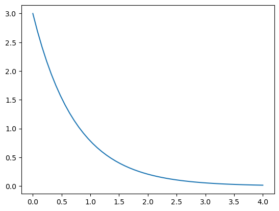
Definimos un conjunto de 51 datos equiespaciados entre 0 y 4, y la función
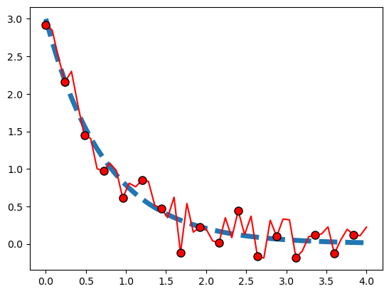
Además, definimos un conjunto de datos con ruido, sumando a \(y\) un ruido gaussiano de media 0 y dispersión 1 (ver help(np.random.normal)):
x = np.linspace(0,4,51)
y = 2.5 * np.exp(-1.3 * x) + 0.5 * np.exp(-1.6 * x)
ruido = 0.2 * np.random.normal(size=x.size)
medicion = y + ruido

print(x.size)
51
# esto sólo hace falta ejecutarlo una vez en el notebook.
%matplotlib inline
plt.plot(x, y)     # Arma el gráfico
plt.show()         # Se muestra el gráfico en la pantalla
help(plt.plot)
Help on function plot in module matplotlib.pyplot:

plot(*args, scalex=True, scaley=True, data=None, **kwargs)
    Plot y versus x as lines and/or markers.

    Call signatures::

        plot([x], y, [fmt], *, data=None, **kwargs)
        plot([x], y, [fmt], [x2], y2, [fmt2], ..., **kwargs)

    The coordinates of the points or line nodes are given by *x*, *y*.

    The optional parameter *fmt* is a convenient way for defining basic
    formatting like color, marker and linestyle. It's a shortcut string
    notation described in the *Notes* section below.

    >>> plot(x, y)        # plot x and y using default line style and color
    >>> plot(x, y, 'bo')  # plot x and y using blue circle markers
    >>> plot(y)           # plot y using x as index array 0..N-1
    >>> plot(y, 'r+')     # ditto, but with red plusses

    You can use `.Line2D` properties as keyword arguments for more
    control on the appearance. Line properties and *fmt* can be mixed.
    The following two calls yield identical results:

    >>> plot(x, y, 'go--', linewidth=2, markersize=12)
    >>> plot(x, y, color='green', marker='o', linestyle='dashed',
    ...      linewidth=2, markersize=12)

    When conflicting with *fmt*, keyword arguments take precedence.


    **Plotting labelled data**

    There's a convenient way for plotting objects with labelled data (i.e.
    data that can be accessed by index ``obj['y']``). Instead of giving
    the data in *x* and *y*, you can provide the object in the *data*
    parameter and just give the labels for *x* and *y*::

    >>> plot('xlabel', 'ylabel', data=obj)

    All indexable objects are supported. This could e.g. be a `dict`, a
    `pandas.DataFrame` or a structured numpy array.


    **Plotting multiple sets of data**

    There are various ways to plot multiple sets of data.

    - The most straight forward way is just to call `plot` multiple times.
      Example:

      >>> plot(x1, y1, 'bo')
      >>> plot(x2, y2, 'go')

    - If *x* and/or *y* are 2D arrays a separate data set will be drawn
      for every column. If both *x* and *y* are 2D, they must have the
      same shape. If only one of them is 2D with shape (N, m) the other
      must have length N and will be used for every data set m.

      Example:

      >>> x = [1, 2, 3]
      >>> y = np.array([[1, 2], [3, 4], [5, 6]])
      >>> plot(x, y)

      is equivalent to:

      >>> for col in range(y.shape[1]):
      ...     plot(x, y[:, col])

    - The third way is to specify multiple sets of *[x]*, *y*, *[fmt]*
      groups::

      >>> plot(x1, y1, 'g^', x2, y2, 'g-')

      In this case, any additional keyword argument applies to all
      datasets. Also this syntax cannot be combined with the *data*
      parameter.

    By default, each line is assigned a different style specified by a
    'style cycle'. The *fmt* and line property parameters are only
    necessary if you want explicit deviations from these defaults.
    Alternatively, you can also change the style cycle using
    :rc:`axes.prop_cycle`.


    Parameters
    ----------
    x, y : array-like or scalar
        The horizontal / vertical coordinates of the data points.
        *x* values are optional and default to ``range(len(y))``.

        Commonly, these parameters are 1D arrays.

        They can also be scalars, or two-dimensional (in that case, the
        columns represent separate data sets).

        These arguments cannot be passed as keywords.

    fmt : str, optional
        A format string, e.g. 'ro' for red circles. See the *Notes*
        section for a full description of the format strings.

        Format strings are just an abbreviation for quickly setting
        basic line properties. All of these and more can also be
        controlled by keyword arguments.

        This argument cannot be passed as keyword.

    data : indexable object, optional
        An object with labelled data. If given, provide the label names to
        plot in *x* and *y*.

        .. note::
            Technically there's a slight ambiguity in calls where the
            second label is a valid *fmt*. ``plot('n', 'o', data=obj)``
            could be ``plt(x, y)`` or ``plt(y, fmt)``. In such cases,
            the former interpretation is chosen, but a warning is issued.
            You may suppress the warning by adding an empty format string
            ``plot('n', 'o', '', data=obj)``.

    Returns
    -------
    list of `.Line2D`
        A list of lines representing the plotted data.

    Other Parameters
    ----------------
    scalex, scaley : bool, default: True
        These parameters determine if the view limits are adapted to the
        data limits. The values are passed on to `autoscale_view`.

    **kwargs : `.Line2D` properties, optional
        *kwargs* are used to specify properties like a line label (for
        auto legends), linewidth, antialiasing, marker face color.
        Example::

        >>> plot([1, 2, 3], [1, 2, 3], 'go-', label='line 1', linewidth=2)
        >>> plot([1, 2, 3], [1, 4, 9], 'rs', label='line 2')

        If you specify multiple lines with one plot call, the kwargs apply
        to all those lines. In case the label object is iterable, each
        element is used as labels for each set of data.

        Here is a list of available `.Line2D` properties:

        Properties:
        agg_filter: a filter function, which takes a (m, n, 3) float array and a dpi value, and returns a (m, n, 3) array
        alpha: scalar or None
        animated: bool
        antialiased or aa: bool
        clip_box: `.Bbox`
        clip_on: bool
        clip_path: Patch or (Path, Transform) or None
        color or c: color
        dash_capstyle: `.CapStyle` or {'butt', 'projecting', 'round'}
        dash_joinstyle: `.JoinStyle` or {'miter', 'round', 'bevel'}
        dashes: sequence of floats (on/off ink in points) or (None, None)
        data: (2, N) array or two 1D arrays
        drawstyle or ds: {'default', 'steps', 'steps-pre', 'steps-mid', 'steps-post'}, default: 'default'
        figure: `.Figure`
        fillstyle: {'full', 'left', 'right', 'bottom', 'top', 'none'}
        gid: str
        in_layout: bool
        label: object
        linestyle or ls: {'-', '--', '-.', ':', '', (offset, on-off-seq), ...}
        linewidth or lw: float
        marker: marker style string, `~.path.Path` or `~.markers.MarkerStyle`
        markeredgecolor or mec: color
        markeredgewidth or mew: float
        markerfacecolor or mfc: color
        markerfacecoloralt or mfcalt: color
        markersize or ms: float
        markevery: None or int or (int, int) or slice or list[int] or float or (float, float) or list[bool]
        path_effects: `.AbstractPathEffect`
        picker: float or callable[[Artist, Event], tuple[bool, dict]]
        pickradius: float
        rasterized: bool
        sketch_params: (scale: float, length: float, randomness: float)
        snap: bool or None
        solid_capstyle: `.CapStyle` or {'butt', 'projecting', 'round'}
        solid_joinstyle: `.JoinStyle` or {'miter', 'round', 'bevel'}
        transform: unknown
        url: str
        visible: bool
        xdata: 1D array
        ydata: 1D array
        zorder: float

    See Also
    --------
    scatter : XY scatter plot with markers of varying size and/or color (
        sometimes also called bubble chart).

    Notes
    -----
    **Format Strings**

    A format string consists of a part for color, marker and line::

        fmt = '[marker][line][color]'

    Each of them is optional. If not provided, the value from the style
    cycle is used. Exception: If ``line`` is given, but no ``marker``,
    the data will be a line without markers.

    Other combinations such as ``[color][marker][line]`` are also
    supported, but note that their parsing may be ambiguous.

    **Markers**

    =============   ===============================
    character       description
    =============   ===============================
    ``'.'``         point marker
    ``','``         pixel marker
    ``'o'``         circle marker
    ``'v'``         triangle_down marker
    ``'^'``         triangle_up marker
    ``'<'``         triangle_left marker
    ``'>'``         triangle_right marker
    ``'1'``         tri_down marker
    ``'2'``         tri_up marker
    ``'3'``         tri_left marker
    ``'4'``         tri_right marker
    ``'8'``         octagon marker
    ``'s'``         square marker
    ``'p'``         pentagon marker
    ``'P'``         plus (filled) marker
    ``'*'``         star marker
    ``'h'``         hexagon1 marker
    ``'H'``         hexagon2 marker
    ``'+'``         plus marker
    ``'x'``         x marker
    ``'X'``         x (filled) marker
    ``'D'``         diamond marker
    ``'d'``         thin_diamond marker
    ``'|'``         vline marker
    ``'_'``         hline marker
    =============   ===============================

    **Line Styles**

    =============    ===============================
    character        description
    =============    ===============================
    ``'-'``          solid line style
    ``'--'``         dashed line style
    ``'-.'``         dash-dot line style
    ``':'``          dotted line style
    =============    ===============================

    Example format strings::

        'b'    # blue markers with default shape
        'or'   # red circles
        '-g'   # green solid line
        '--'   # dashed line with default color
        '^k:'  # black triangle_up markers connected by a dotted line

    **Colors**

    The supported color abbreviations are the single letter codes

    =============    ===============================
    character        color
    =============    ===============================
    ``'b'``          blue
    ``'g'``          green
    ``'r'``          red
    ``'c'``          cyan
    ``'m'``          magenta
    ``'y'``          yellow
    ``'k'``          black
    ``'w'``          white
    =============    ===============================

    and the ``'CN'`` colors that index into the default property cycle.

    If the color is the only part of the format string, you can
    additionally use any  `matplotlib.colors` spec, e.g. full names
    (``'green'``) or hex strings (``'#008000'``).

%matplotlib inline
plt.plot(x, y)
plt.show()
Líneas, símbolos y colores#
La forma más simple de elegir el modo de graficación de la curva es a través de un tercer argumento. Este argumento, que aparece inmediatamente después de los datos (x e y), permite controlar el tipo de línea o símbolo utilizado en la graficación. En el caso de la línea sólida se puede especificar con un guión (‘-‘) o simplemente no poner nada, ya que línea sólida es el símbolo por defecto. Las dos especificaciones anteriores son equivalentes. También se puede elegir el color, o el símbolo a utilizar con este argumento:
plot(x,y,'g-')
plot(x,y,'ro')
plot(x,y,'r-o')

Para obtener círculos usamos una especificación que corresponde a ‘o’. Además podemos poner en este argumento el color. En este caso elegimos graficar en color “rojo (r), con una línea (-) + círculos (o)”.
Con esta idea modificamos el gráfico anterior
%matplotlib notebook
%matplotlib notebook

plt.plot(x, medicion, 'v--')
plt.plot(x, y, 'c-')
plt.show()
Los siguientes caracteres pueden utilizarse para controlar el símbolo de graficación:
Símbolo |
Descripción |
|---|---|
‘-‘ |
solid line style |
‘–’ |
dashed line style |
‘-.’ |
dash-dot line style |
‘:’ |
dotted line style |
‘.’ |
point marker |
‘,’ |
pixel marker |
‘o’ |
circle marker |
‘v’ |
triangle down marker |
‘^’ |
triangle up marker |
‘<’ |
triangle left marker |
‘>’ |
triangle right marker |
‘1’ |
tri down marker |
‘2’ |
tri up marker |
‘3’ |
tri left marker |
‘4’ |
tri right marker |
‘s’ |
square marker |
‘p’ |
pentagon marker |
‘*’ |
star marker |
‘h’ |
hexagon1 marker |
‘H’ |
hexagon2 marker |
‘+’ |
plus marker |
‘x’ |
x marker |
‘D’ |
diamond marker |
‘d’ |
thin diamond marker |
‘|’ |
vline marker |
‘_’ |
hline marker |
Los colores también pueden elegirse usando los siguientes caracteres:
Letra |
Color |
|---|---|
‘b’ |
blue |
‘g’ |
green |
‘r’ |
red |
‘c’ |
cyan |
‘m’ |
magenta |
‘y’ |
yellow |
‘k’ |
black |
‘w’ |
white |
La función plot() acepta un número variable de argumentos. Veamos lo que dice la documentación
Signature: plt.plot(*args, **kwargs)
Docstring:
Plot y versus x as lines and/or markers.

Call signatures::

    plot([x], y, [fmt], data=None, **kwargs)
    plot([x], y, [fmt], [x2], y2, [fmt2], ..., **kwargs)```

En particular, podemos usar los argumentos *keywords* (pares nombre-valor) para cambiar el modo en que se grafican los datos. Algunos de los más comunes son:

| Argumento       | Valor                        |
|-----------------|------------------------------|
| linestyle       | {'-', '–', '-.', ':', '', …} |
| linewidth       | número real                  |
| color           | un color                     |
| marker          | {'o', 's', 'd', ….}          |
| markersize      | número real                  |
| markeredgecolor | color                        |
| markerfacecolor | color                        |
| markevery       | número entero                |
%matplotlib notebook
plt.plot(x,y,linewidth=4)
plt.plot(x,medicion, 'o:', color='red', markersize=6)
plt.show()
plt.plot(x,medicion, 'o:', color='red', markersize=5)
plt.plot(x,y,linewidth=4)
plt.show()
%matplotlib inline
plt.plot(x,y,linewidth=5, linestyle='dashed')
plt.plot(x,medicion, '-o', color='red', markersize=8, markeredgecolor='black',markevery=3)
plt.show()
Nombres de ejes y leyendas#
Vamos ahora a agregar nombres a los ejes y a las curvas.
Para agregar nombres a las curvas, tenemos que agregar un label, en este caso en el mismo comando plot(), y luego
mostrarlo con `legend()
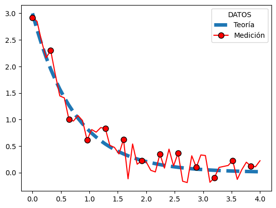
plt.plot(x,y,linewidth=5, linestyle='dashed', label='Teoría')
plt.plot(x,medicion, '-o', color='red', markersize=8, markeredgecolor='black',markevery=4, label='Medición')
plt.legend(title='DATOS')
plt.show()
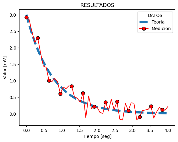
Para agregar nombres a los ejes usamos xlabel y ylabel:
Los títulos a la figura se pueden agregar con title:
plt.plot(x,y,linewidth=5, linestyle='dashed', label='Teoría')
plt.plot(x,medicion, '-o', color='red', markersize=8, markeredgecolor='black',markevery=4, label='Medición')
plt.legend(title='DATOS')
plt.xlabel('Tiempo [seg]')
plt.ylabel('Valor [mV]')
plt.title('RESULTADOS')
plt.show()
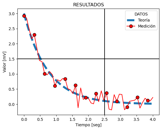
Podemos tambien graficar lineas verticales y horizontales usando axvline y axhline
plt.plot(x,y,linewidth=5, linestyle='dashed', label='Teoría')
plt.plot(x,medicion, '-o', color='red', markersize=8, markeredgecolor='black',markevery=4, label='Medición')
plt.legend(title='DATOS')
plt.xlabel('Tiempo [seg]')
plt.ylabel('Valor [mV]')
plt.title('RESULTADOS')
plt.axvline(x=2.5, color='black')
plt.axhline(y = 1.5, color='black')
plt.show()
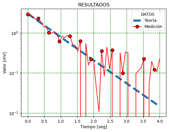
Para pasar a escala logarítmica usamos xscale o yscale
plt.plot(x,y,linewidth=5, linestyle='dashed', label='Teoría')
plt.plot(x,medicion, '-o', color='red', markersize=8, markeredgecolor='black',markevery=4, label='Medición')
plt.legend(title='DATOS')
plt.xlabel('Tiempo [seg]')
plt.ylabel('Valor [mV]')
plt.title('RESULTADOS')
#plt.xscale('log')
plt.yscale('log')
plt.grid(color='green', linestyle='dashed', linewidth=1)
plt.show()
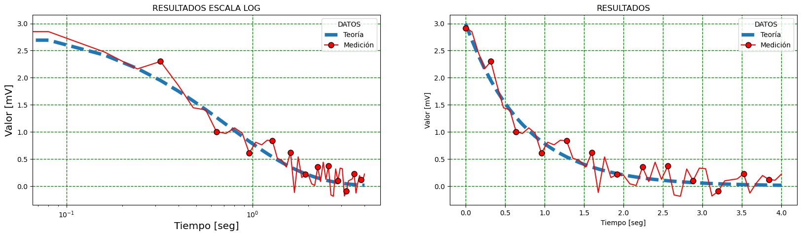
Dos gráficos en la misma figura#
Hay varias funciones que permiten poner más de un gráfico en la misma figura. Veamos un ejemplo utilizando figure y add_subplot
fig_1 = plt.figure(1, figsize=[20, 5])
graf1 = fig_1.add_subplot(121) #1: número de filas 2: número de columnas 1:el número de subplot
graf2 = fig_1.add_subplot(122) #1: número de filas 2: número de columnas 2:el número de subplot

graf1.plot(x,y,linewidth=5, linestyle='dashed', label='Teoría')
graf1.plot(x,medicion, '-o', color='red', markersize=8, markeredgecolor='black',markevery=4, label='Medición')
graf1.legend(title='DATOS')
graf1.grid(color='green', linestyle='dashed', linewidth=1)

graf1.set_xlabel('Tiempo [seg]', fontsize='x-large')
graf1.set_ylabel('Valor [mV]', fontsize='x-large')
graf1.set_title('RESULTADOS ESCALA LOG')
graf1.set_xscale('log')

graf2.plot(x,y,linewidth=5, linestyle='dashed', label='Teoría')
graf2.plot(x,medicion, '-o', color='red', markersize=8, markeredgecolor='black',markevery=4, label='Medición')
graf2.legend(title='DATOS')
graf2.grid(color='green', linestyle='dashed', linewidth=1)

graf2.set_xlabel('Tiempo [seg]')
graf2.set_ylabel('Valor [mV]')
graf2.set_title('RESULTADOS')
plt.show()
print(type(fig_1))
<class 'matplotlib.figure.Figure'>
Exportar las figuras#
Para guardar las figuras en alguno de los formatos disponibles utilizamos la función savefig().
foname = 'miplot'
# fig_1.savefig('{}.png'.format(foname), dpi=200)
# fig_1.savefig('{}.pdf'.format(foname))
fig_1.savefig('figura2.png', dpi=200)
fig_1.savefig('figura2.pdf')
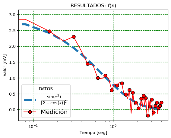
Acá también se puede utilizar formato tipo LaTeX para parte del texto. Si utilizamos una expresión encerrada entre los símbolos $, matplotlib interpreta que está escrito en (un subconjunto) de LaTeX.
Matplotlib tiene un procesador de símbolos interno para mostrar la notación en LaTeX que reconoce los elementos más comunes, o puede elegirse utilizar un procesador LaTeX externo.
plt.plot(x,y,linewidth=5, linestyle='dashed', label=r"$\frac{\sin(e^2)}{[2 + \cos (x)]^2}$")
plt.plot(x,medicion, '-o', color='red', markersize=8, markeredgecolor='black',markevery=2, label='Medición')
plt.legend(title='DATOS', fontsize='x-large', shadow=False, loc=3)
plt.xlabel('Tiempo [seg]')
plt.ylabel('Valor [mV]')
plt.title('RESULTADOS: $f(x)$')
plt.xscale('log')
plt.grid(color='green', linestyle='dashed', linewidth=1)
plt.show()
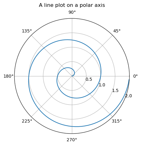
GRAFICOS CON COORDENADAS POLARES#
import numpy as np
import matplotlib.pyplot as plt


r = np.arange(0, 2, 0.01)
theta = 2 * np.pi * r

fig, ax = plt.subplots(subplot_kw={'projection': 'polar'})
ax.plot(theta, r)
ax.set_rmax(2)
ax.set_rticks([0.5, 1, 1.5, 2])  # Less radial ticks
ax.set_rlabel_position(-22.5)  # Move radial labels away from plotted line
ax.grid(True)

ax.set_title("A line plot on a polar axis", va='bottom')
plt.show()
print(theta)
[ 0.          0.06283185  0.12566371  0.18849556  0.25132741  0.31415927
  0.37699112  0.43982297  0.50265482  0.56548668  0.62831853  0.69115038
  0.75398224  0.81681409  0.87964594  0.9424778   1.00530965  1.0681415
  1.13097336  1.19380521  1.25663706  1.31946891  1.38230077  1.44513262
  1.50796447  1.57079633  1.63362818  1.69646003  1.75929189  1.82212374
  1.88495559  1.94778745  2.0106193   2.07345115  2.136283    2.19911486
  2.26194671  2.32477856  2.38761042  2.45044227  2.51327412  2.57610598
  2.63893783  2.70176968  2.76460154  2.82743339  2.89026524  2.95309709
  3.01592895  3.0787608   3.14159265  3.20442451  3.26725636  3.33008821
  3.39292007  3.45575192  3.51858377  3.58141563  3.64424748  3.70707933
  3.76991118  3.83274304  3.89557489  3.95840674  4.0212386   4.08407045
  4.1469023   4.20973416  4.27256601  4.33539786  4.39822972  4.46106157
  4.52389342  4.58672527  4.64955713  4.71238898  4.77522083  4.83805269
  4.90088454  4.96371639  5.02654825  5.0893801   5.15221195  5.2150438
  5.27787566  5.34070751  5.40353936  5.46637122  5.52920307  5.59203492
  5.65486678  5.71769863  5.78053048  5.84336234  5.90619419  5.96902604
  6.03185789  6.09468975  6.1575216   6.22035345  6.28318531  6.34601716
  6.40884901  6.47168087  6.53451272  6.59734457  6.66017643  6.72300828
  6.78584013  6.84867198  6.91150384  6.97433569  7.03716754  7.0999994
  7.16283125  7.2256631   7.28849496  7.35132681  7.41415866  7.47699052
  7.53982237  7.60265422  7.66548607  7.72831793  7.79114978  7.85398163
  7.91681349  7.97964534  8.04247719  8.10530905  8.1681409   8.23097275
  8.29380461  8.35663646  8.41946831  8.48230016  8.54513202  8.60796387
  8.67079572  8.73362758  8.79645943  8.85929128  8.92212314  8.98495499
  9.04778684  9.1106187   9.17345055  9.2362824   9.29911425  9.36194611
  9.42477796  9.48760981  9.55044167  9.61327352  9.67610537  9.73893723
  9.80176908  9.86460093  9.92743279  9.99026464 10.05309649 10.11592834
 10.1787602  10.24159205 10.3044239  10.36725576 10.43008761 10.49291946
 10.55575132 10.61858317 10.68141502 10.74424688 10.80707873 10.86991058
 10.93274243 10.99557429 11.05840614 11.12123799 11.18406985 11.2469017
 11.30973355 11.37256541 11.43539726 11.49822911 11.56106097 11.62389282
 11.68672467 11.74955652 11.81238838 11.87522023 11.93805208 12.00088394
 12.06371579 12.12654764 12.1893795  12.25221135 12.3150432  12.37787506
 12.44070691 12.50353876]
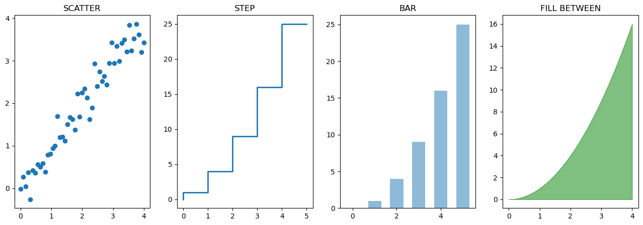
OTROS GRAFICOS 2D#
n = np.array([0,1,2,3,4,5])

fig, graf = plt.subplots(1,4, figsize=[16,5])
graf[0].set_title('SCATTER')
graf[0].scatter(x, x + 0.25*np.random.randn(len(x)))

graf[1].set_title('STEP')
graf[1].step(n,n**2, lw=2)

graf[2].set_title('BAR')
graf[2].bar(n,n**2, align='center', width=0.6, alpha=0.5)

graf[3].set_title('FILL BETWEEN')
graf[3].fill_between(x, x**2, color='green', alpha=0.5)
<matplotlib.collections.PolyCollection at 0x7fd182de9af0>
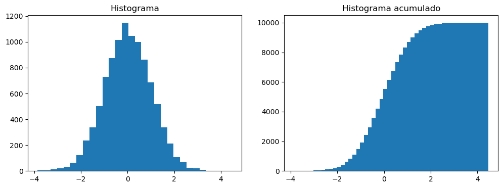
HISTOGRAMAS#
n = np.random.randn(10000) #randn devuelve una distribucion normal
fig, axes = plt.subplots(1, 2, figsize=[12,4])
axes[0].set_title('Histograma')
axes[0].hist(n, bins = 30)

axes[1].set_title('Histograma acumulado')
axes[1].hist(n, cumulative=True, bins=50)
plt.show()
A = np.array([2,3,4,5])
Leyendo una imagen#
Además de realizar gráficos 2D, matplotlib permite trabajar con imágenes. Se pueden leer imágenes que son interpretadas como un array de numpy.
import matplotlib.image as mpimg

grace = mpimg.imread('../Assets/grace_hopper.jpg')
print(grace.shape)
print(type(grace))


jean = mpimg.imread('../Assets/jean_sammet.jpg')
print(type(jean))

cirs = mpimg.imread('../Assets/cirs_slice.png')
---------------------------------------------------------------------------
FileNotFoundError                         Traceback (most recent call last)
Cell In[23], line 3
      1 import matplotlib.image as mpimg
----> 3 grace = mpimg.imread('../Assets/grace_hopper.jpg')
      4 print(grace.shape)
      5 print(type(grace))

File /opt/miniconda3/lib/python3.9/site-packages/matplotlib/image.py:1560, in imread(fname, format)
   1558                 response = io.BytesIO(response.read())
   1559             return imread(response, format=ext)
-> 1560 with img_open(fname) as image:
   1561     return (_pil_png_to_float_array(image)
   1562             if isinstance(image, PIL.PngImagePlugin.PngImageFile) else
   1563             pil_to_array(image))

File /opt/miniconda3/lib/python3.9/site-packages/PIL/Image.py:3227, in open(fp, mode, formats)
   3224     filename = fp
   3226 if filename:
-> 3227     fp = builtins.open(filename, "rb")
   3228     exclusive_fp = True
   3230 try:

FileNotFoundError: [Errno 2] No such file or directory: '../Assets/grace_hopper.jpg'
print(grace)
[[[226 226 226]
  [226 226 226]
  [226 226 226]
  ...
  [244 244 244]
  [243 243 243]
  [244 244 244]]

 [[226 226 226]
  [226 226 226]
  [226 226 226]
  ...
  [244 244 244]
  [243 243 243]
  [245 245 245]]

 [[226 226 226]
  [226 226 226]
  [226 226 226]
  ...
  [244 244 244]
  [243 243 243]
  [245 245 245]]

 ...

 [[220 220 220]
  [217 217 217]
  [218 218 218]
  ...
  [238 238 238]
  [238 238 238]
  [246 246 246]]

 [[220 220 220]
  [217 217 217]
  [218 218 218]
  ...
  [238 238 238]
  [238 238 238]
  [246 246 246]]

 [[220 220 220]
  [217 217 217]
  [218 218 218]
  ...
  [238 238 238]
  [238 238 238]
  [246 246 246]]]
Ambas imágenes tienen 3 canales, Rojo, Verde y Azul, que puede verse en el shape de cada una de ellas:
print(grace.shape)
print(jean.shape)
(403, 600, 3)
(360, 640, 3)
fig5, g = plt.subplots(1, 2, figsize=[16,10])
graceplt = g[0].imshow(grace)
g[0].set_title('Grace Hopper')
plt.colorbar(graceplt,ax = g[0],orientation='horizontal')

jeanplt = g[1].imshow(jean)
g[1].set_title('Jean Sammet')
plt.colorbar(jeanplt,ax = g[1],orientation='horizontal')

plt.show()
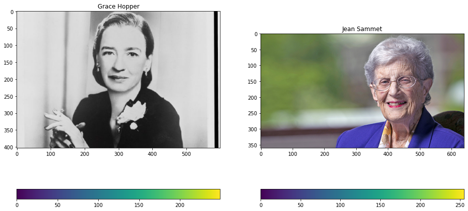
fig5, g = plt.subplots(1, 2, figsize=[16,10])
graceplt = g[0].imshow(grace[:,:,0], cmap = 'Paired')
g[0].set_title('Grace Hopper')
plt.colorbar(graceplt,ax = g[0],orientation='horizontal')

jeanplt = g[1].imshow(jean[:,:,0],cmap = 'Paired')
g[1].set_title('Jean Sammet')
plt.colorbar(jeanplt,ax = g[1],orientation='horizontal')

plt.show()
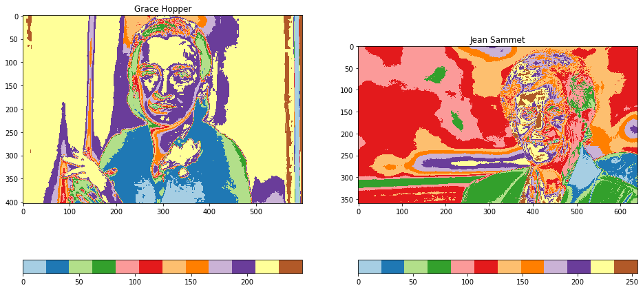
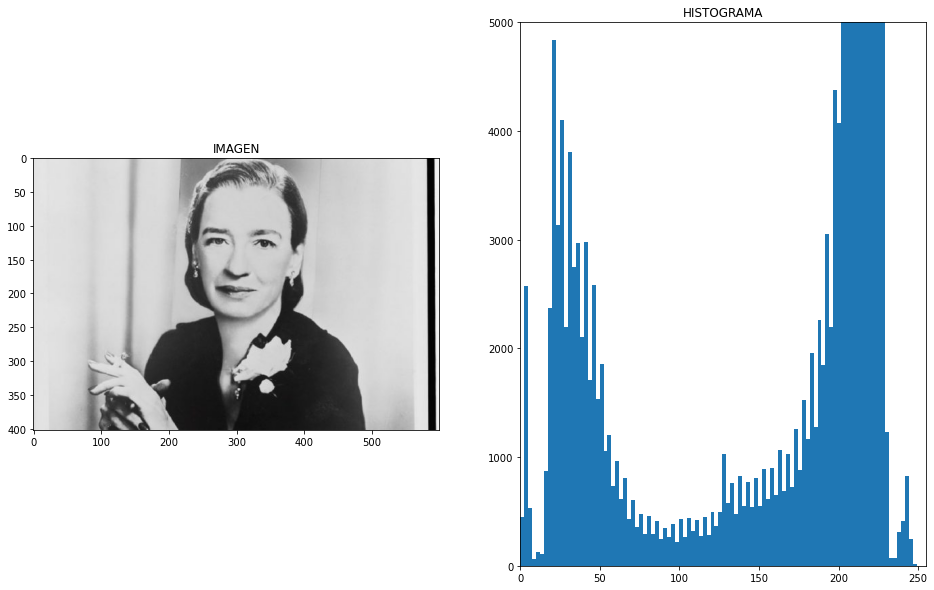
fig5, g = plt.subplots(1, 2, figsize=[16,10])
g[0].imshow(grace, cmap = 'gray')
g[0].set_title('IMAGEN')

g[1].set_title('HISTOGRAMA')
g[1].hist(grace[:,:,0].ravel(), bins=100) #ravel devuelve un vector 1D con todos los elementosde la matrix.
g[1].set_xlim([0, 255])
g[1].set_ylim([0, 5000])

plt.show()
ravel_grace = grace.ravel()
ravel_grace.shape
print(ravel_grace)
[226 226 226 ... 246 246 246]
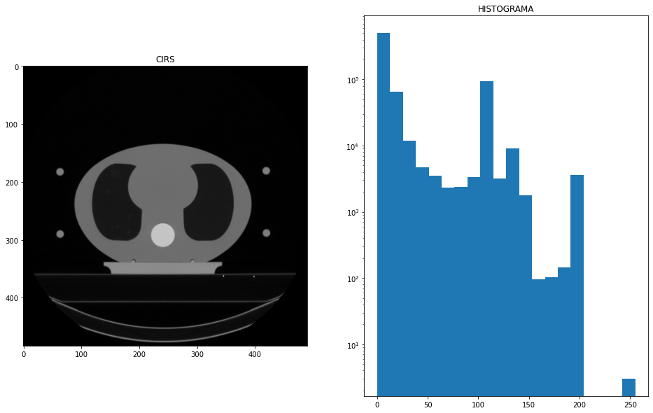
Algo a tener en cuenta es que las imágenes pueden venir definidas como RGB con enteros entre 0 y 255, como las imágenes anteriores; o entre 0 y 1, como la siguiente:
cirs = mpimg.imread('../Assets/cirs_slice.png')
print(type(cirs))
print(cirs.shape)
print("Max image: ",np.max(cirs))
#
#  Puedo normalizar la imagen al rango 0-1
#
img_maximo = np.max(cirs)
cirs = cirs/img_maximo
#
#  Normalizo la imagen al rango 0-255
#
img_maximo = np.max(cirs)
cirs = cirs/img_maximo*255
cirs = cirs.astype(int) # Convierte el array de numpy de float a enteros


figcirs, g = plt.subplots(1, 2, figsize=[16,10])
g[0].imshow(cirs)
g[0].set_title('CIRS')

g[1].set_title('HISTOGRAMA')
g[1].hist(cirs.ravel(), bins=20, log=True) #ravel devuelve un vector 1D con todos los elementosde la matrix.
# g[1].set_xlim([0,1])
# g[1].set_ylim([0.1, 1000])
# g[1].set_yscale('log')

plt.show()
<class 'numpy.ndarray'>
(483, 491, 3)
Max image:  1.0
print(cirs)
[[[0 0 0]
  [0 0 0]
  [0 0 0]
  ...
  [0 0 0]
  [0 0 0]
  [0 0 0]]

 [[0 0 0]
  [0 0 0]
  [0 0 0]
  ...
  [0 0 0]
  [0 0 0]
  [0 0 0]]

 [[0 0 0]
  [0 0 0]
  [0 0 0]
  ...
  [0 0 0]
  [0 0 0]
  [0 0 0]]

 ...

 [[0 0 0]
  [0 0 0]
  [0 0 0]
  ...
  [0 0 0]
  [0 0 0]
  [0 0 0]]

 [[0 0 0]
  [0 0 0]
  [0 0 0]
  ...
  [0 0 0]
  [0 0 0]
  [0 0 0]]

 [[0 0 0]
  [0 0 0]
  [0 0 0]
  ...
  [0 0 0]
  [0 0 0]
  [0 0 0]]]
También se puede calcular el histograma en numpy:
#
#  Puedo normalizar la imagen al rango 0-1
#
img_maximo = np.max(cirs)
cirs = cirs/img_maximo


nbins = 20
c = cirs.ravel()
h = np.histogram(c,bins=nbins) # np.histogram devuelve una tupla con dos arrays, el primero
                            # es el histograma, el segundo corresponde a los límites de los bines
print(type(h[0]))
print(h[0])
print(h[0].shape)
print(h[1].shape)
Pero es más trabajoso hacer el histograma a mano:
Hay que notar la diferencia en el tamaño entre el histograma en
h[0]y los límites de los bines enh[1]. Por eso es necesario seleccionar todos los elementos deh[1]excepto el último conh[1][:-1].Además usamos
align='edge'para que las barras queden alineadas a la izquierda de cada intervalo.
widthbar = 1/nbins*0.95
plt.bar(h[1][:-1],h[0],width = widthbar,align='edge',log=True)


print(h[0])
print(h[1][:-1])